Complementary Colours or Close Neighbours? Two Ways to Build a Palette
Complementary colours or close neighbours can shape a small drawing in very different ways; choose a palette that clarifies its subject and mood.
The common mistake with complementary colours is to choose the brightest pair and spread both across a small drawing. The result can be a divided focal point: the eye jumps between colours instead of settling on the subject. Complementary colours or close neighbours are not competing recipes; they are different ways to direct attention.
A complementary pair creates opposition, while neighbouring hues make transitions feel connected. Which works better depends on what the drawing needs to express, and on how the shapes are arranged.
When do complementary colours help a subject stand out?
Complementary colours sit opposite one another on a colour wheel. Blue and orange, red and green, and yellow and violet are familiar pairings. Put near each other, their difference can make an edge or small accent noticeable.
Give the pair a clear hierarchy. If a blue cup is the subject and an orange tabletop surrounds it, keep the blue as the main colour and use orange in the setting or in a small reflected mark. If both hues occupy equally vivid areas, neither may feel like the intended focus.
The colours need not be bright. A muted blue-grey beside rusty orange still gives the drawing a contrast, but the effect is quieter. Differences in lightness can help too: a pale hue beside a dark one separates shapes without relying on intensity alone.
- Check which shape should attract attention first; if one is the focal point, make its complementary partner a smaller accent, otherwise soften the pair or distribute it more evenly.
- Check whether adjacent colours feel too forceful; if they do, mute one or both, otherwise keep their strength where the contrast serves the subject.
- Check whether the main forms separate by lightness as well as hue; if they merge, lighten or darken one, otherwise retain the current contrast.
Try a complementary colour in a small area before giving it a large role.
Why might close neighbours make a calmer palette?
Close neighbours are hues beside one another on the colour wheel, such as yellow, yellow-green and green. They share some colour character, so the eye can move between them without meeting a sharp opposition.
This is useful when the subject depends on gradual changes: a leaf, folded cloth, fruit or a quiet landscape. A leaf could use yellow-green along its lit edge, green across its centre and blue-green in the shadow. The hues remain related, while their shifts help describe the form.
Related colours can blur together if they have similar lightness and saturation. If the shapes become hard to distinguish, make one colour lighter, darker or less vivid. A restrained set of neighbours often gives a small drawing enough variation without making every transition compete for attention.
- Check whether the subject has gradual colour changes; if it does, begin with neighbouring hues, otherwise consider a stronger contrast at the focal point.
- Check whether neighbouring shapes merge at a glance; if they do, alter lightness or saturation, otherwise preserve their gentle transitions.
- Check whether a long chain of hues distracts from the form; if it does, remove a colour, otherwise keep the transitions that clarify the subject.
When continuity matters more than a striking accent, let related hues carry most of the drawing.
How do you choose between complementary colours and close neighbours?
Which palette makes a focal point easier to see?
A complementary pair can make a focal shape stand out when one hue is used sparingly around it. With close neighbours, the focus can instead emerge from shape, placement or lightness.
Can a drawing use both approaches?
Yes. Build most of the image from neighbouring hues, then place a modest complementary accent where attention should pause. Keep the accent local so it does not split the composition into two competing fields.
What if the colours look dull or too intense?
If related hues look indistinct, adjust their lightness or saturation so the shapes separate. If a complementary pair feels too intense, reduce the area of one colour or choose a softer version.
How can I compare palettes without making two finished drawings?
Use the same outline and paper for two small colour blocks, changing only the palette. Compare how each version directs attention and describes the subject, rather than judging isolated swatches alone.
What can the subject’s setting tell you about the palette?
A colour relationship can echo something already present in a scene. A blue cup on an orange table has an obvious opposition; a green leaf with yellow-green light and blue-green shade offers smaller, connected shifts. Look at the arrangement of shapes and the kind of attention it invites, not just the named object.
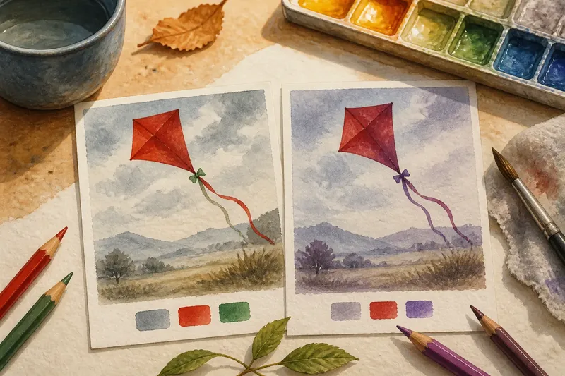
Imagine you are drawing a red paper kite against a grey sky, using coloured pencil on white paper. You want the kite to read first, but you also want its trailing ribbon to remain visible. In one version, you colour the kite red and keep the sky pale grey, then use a small green mark at the ribbon’s knot; the expected result is a clear focal shape with one sharp colour accent. In another, you use red, red-violet and violet across the kite and ribbon, with the same grey sky; the expected result is a more connected movement through the coloured forms, but less opposition at the knot. If the ribbon disappears in the second version, darken its edge; if the first version makes the knot steal attention, remove the green mark. The choice follows the drawing’s priority, not a rule that kites must use a particular palette.
The example also shows why the surrounding space matters. A colour that feels lively beside white paper may seem subdued beside a strong background. Consider both the subject and the shapes around it before choosing the relationship.
How do materials affect the colours you see?
Coloured pencil can build colour through layers, so a softened hue may cover or mingle with earlier marks. Watercolour lets the paper show through and can look different while wet than after drying. Gouache is more opaque, while a digital palette lets you duplicate an image and change a swatch without redrawing it.
Use the material you plan to draw with when comparing colours. For pencil, make marks on the same paper and ground as the drawing. For watercolour or gouache, let the sample dry before deciding. On a screen, view the versions at the same size and against the intended background.
Hue means the colour family, such as blue or orange. Lightness describes how pale or dark it appears; saturation describes how vivid or muted it seems. If important forms merge, check lightness and edges as well as hue. A greyscale view can help reveal whether the drawing depends too heavily on colour alone.
- Check whether a pencil swatch is on the intended paper; if not, repeat it on that paper, otherwise judge the existing mark.
- Check whether a watercolour sample is dry; if not, wait before deciding, otherwise compare its colour with the drawing.
- Check whether digital versions are shown at the same scale and background; if not, align those conditions, otherwise compare how each palette guides attention.
Judge the colours in the medium and setting in which they will actually appear.
How can you decide which palette serves the drawing?
At the intended viewing size, check whether the subject is easy to locate, whether its neighbouring shapes remain distinct and whether the colour relationship suits the mood. If the palette feels divided, reduce the area or intensity of one complementary colour. If it feels flat, strengthen a lightness difference or introduce a small contrast where it clarifies a form.
Complementary colours or close neighbours offer two ways to organise attention: opposition for emphasis and related hues for continuity. Let the subject’s shapes, setting and medium decide which relationship deserves more space.